Digital Scholarship Lab. University of Richmond, 2014. http://dsl.richmond.edu/projects/
Reviewed by Leah Miller, Dickinson College
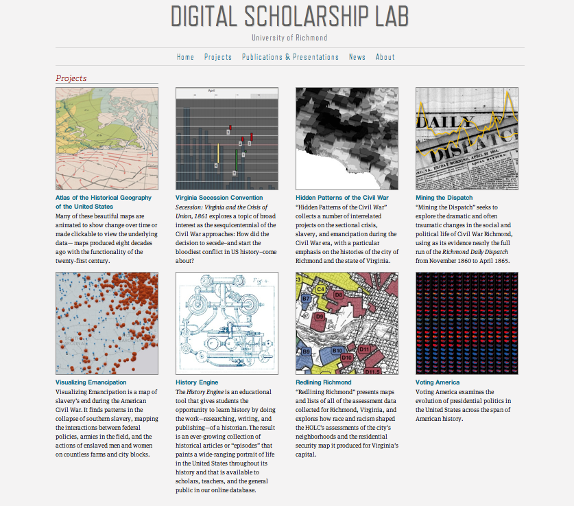
DSL Projects gateway
The Digital Scholarship Lab at the University of Richmond uses technology to digitize and present historical data in a way that reveals hidden patterns. The lab consists of eight main projects which present various insights into American history:
- Atlas of the Historical Geography of the United States
- Virginia Secession Convention
- Hidden Patterns of the Civil War
- Mining the Dispatch
- Visualizing Emancipation
- History Engine
- Redlining Richmond
- Voting America
While the data covered by these projects spans all of American history from Columbus to the present, particular focus is devoted to the nineteenth century. Rather than presenting the large-scale, political history which is available in the average classroom textbook, these projects analyze the movements and actions of the common person. The result is a series of new stories about the experience of the average American—white, black, male, female—who worked, migrated, fought, and suffered for their freedom.
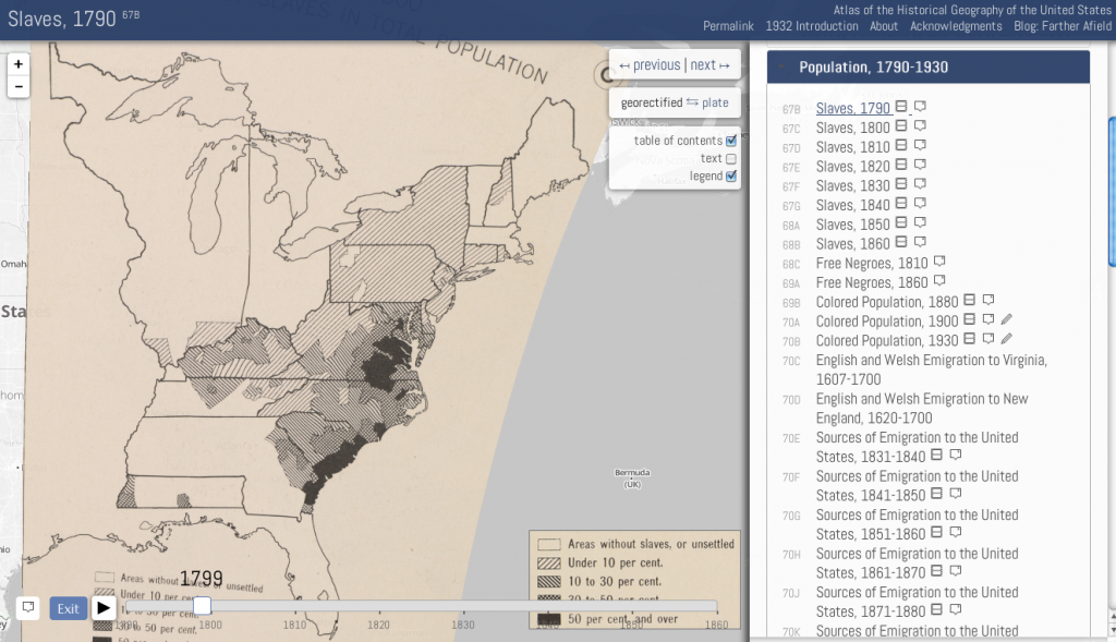 The most recent project is the digitized Atlas of the Historical Geography of the United States, originally drawn up in 1932 by U.S. naval historian Charles O. Paullin and geographer John K. Wright. The print edition of the atlas—which includes over 700 maps on 166 plates that cover American history from 1492 to 1930—has greatly impacted many historical publications even to the present day. Recently for the New York Times, project director Robert K. Nelson explained that “Paullin’s maps show ordinary people making a living, moving across the landscape, worshipping at churches, voting in elections.” This new, digital edition changes the way we can interpret these maps. Each map has been georeferenced and georectified to provide accurate and optimal web-viewing, but the viewer can switch to a high-quality scan of the original plates. The user can also toggle a sidebar with Paullin’s original text and legends, as well as zoom in and out and adjust the transparency of the map overlay. Permalinks save all these preferences and ensure they can be accessed in the future. Series of maps that show progression of movement or activity through time have been animated. For example, the animation of slave populations from 1790-1860 shows the concentration of southern slave power and its expansion westward concurrently with gradual emancipation of slaves in the North. Furthermore, the statistical annotations provided for this map declare the exact numbers and percentages of slaves in each county, and by 1820 provide a breakdown of the slaves’ genders. Some maps are accompanied by additional analytical blog posts. “Vanishing Indians,” by lab director Robert K. Nelson, discusses the atlas’ shortcomings when it comes to portraying Native Americans in their relationships to each other.
 The Visualizing Emancipation project is another interactive map which highlights slavery’s end during the Civil War. The map “presents a history of emancipation where brutality is sometimes easier to see than generosity and where the costs of war and freedom fell disproportionately on the most vulnerable in the South.” Users can filter through different types of emancipation events (i.e. African Americans helping the Union, their captures by either army, fugitive slave-related incidents, etc.), as well as different types of sources, including books, newspapers, official records, or personal papers. Like the Atlas, this map is animated, so as the user toggles pins and filters on and off, she can follow the relationship between emancipation and the position of the Union army, or the agency of slaves in obtaining their own freedom. The project also features certain events and figures as starting points for understanding emancipation, with the ability to pinpoint each event on the map. I only wish that there were at least one featured example where a person or group were involved in multiple events, so a user could follow their physical journey using the map. For those teaching emancipation, there is an accompanying lesson plan and worksheet. Students are encouraged to contribute by submitting information they find in primary source documents, since the map, which covers “only a small slice of the available evidence documenting the end of slavery,” could never be complete.
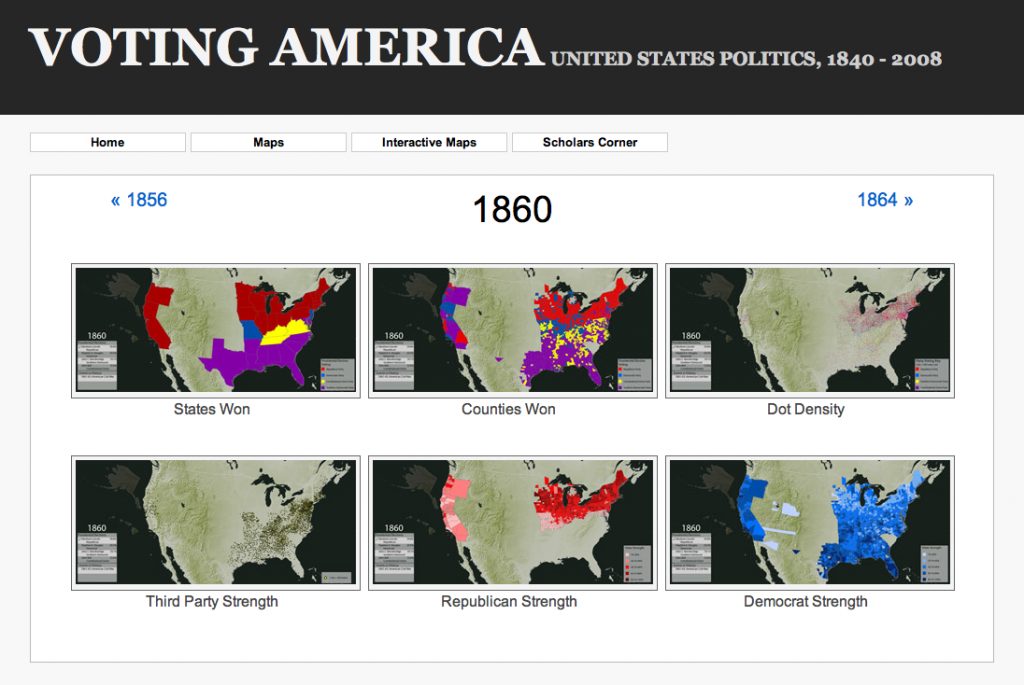 Voting America also makes use of animated maps to show changes and differences in voting preferences for presidential and congressional elections (1840–2008). The key factor is scope, which illuminates different patterns and trends. For example, changing popular votes at the state level show which parties won each election, while at the county level show how each state was politically divided. The dot-density maps are even more democratic, as 1 dot=500 votes in an area; this way, more third-party votes are recorded. For these types of maps, every legend shows important political events in history; so, one can watch the progression of voter turnout since 1840 and note the effect the Fifteenth and Twentieth Amendments had. The user also has the option to view individual elections in each of these capacities. Population maps show the location and movements of black Americans (represented—a bit stereotypically—as black dots) and white Americans (represented by pink dots). Unfortunately there is no option to view these populations together, nor is there any representation of immigrant populations. The project is accompanied by an interactive map which can be used to compare presidential election years, but my computer, running Adobe flash player version 12.0.0.38, was unable to open it. An alternative version is available through Google Maps, but currently this feature is down. Finally, a “Scholars Corner” provides expert analysis by DSL staff on certain voting trends.
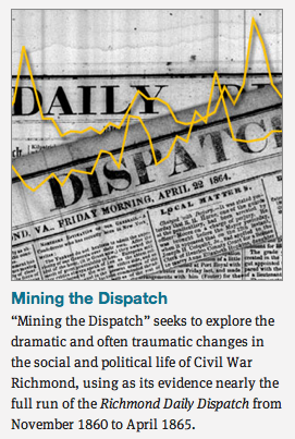 Three other projects in the lab focus on the American Civil War. Mining the Dispatch uses topic-modeling, a computerized method of pulling together multiple documents that have the same key words within them. This can reveal interesting categories and patterns among texts. In this case, Nelson ran every issue of the Richmond Daily Dispatch from November 1860 to Lincoln’s death in April 1865. Some of the more interesting topics are fugitive slave ads, anti-northern diatribes, military recruitment versus conscription, humor etc. Nelson juxtaposed line graphs showing the frequency of similar topics, and, tentatively, relationships emerged. This project is still in its preliminary phase and because of its algorithmic collection process, the data is imperfect. Still, it is a good jumping off point for research questions.
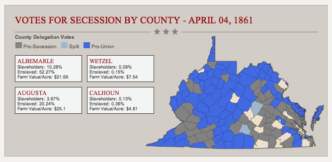
The Virginia Secession Convention project seems to diverge from the site’s aim to tell the average American’s story. It seeks to explain the decision of the VA delegates to secede from the Union through their full-text searchable speeches and the Convention’s proceedings. However, as the Data Visualizations page shows, their decisions were likely influenced by their constituents. Each county is annotated with statistics about the constituents: percentages of slaveholders and the enslaved, average farm value per acre, and pro- or anti-Union stances.
Finally, though Hidden Patterns of the Civil War largely highlights many of the projects already discussed, it also includes other mini-projects and tools, like a collection of maps that shows the migration patterns of black Virginians who married after the war, a Google Earth tour of the Richmond slave market developed from a sketch by painter Eyre Crowe, and a full-access digital database of the Richmond Daily Dispatch during the Civil War.
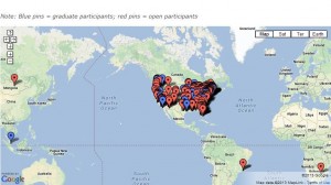
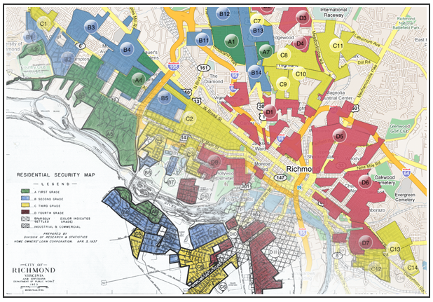 While the two remaining projects are less relevant to the nineteenth century, they are great tools for the classroom. Redlining Richmond maps and annotates the racist categorizations of the Home Owners’ Loan Corporation (a New Deal agency) in the late ’30s. The assigned value of each neighborhood is based on race and nationality, and shows the lingering effects of slavery in the Jim Crow era. The History Engine is a “moderated wiki” where students generate three-paragraph “episodes” (rather than arguments) about people, places, or events in American history, drawing on local university or online archives and secondary sources. Because registration is required, each submission is carefully screened for quality and accuracy. The project’s aim is to place students from around the world in conversation with each other and their work.
The eight projects of the Digital Scholarship Lab thoughtfully and extensively explore the individual experiences of Americans during the nineteenth century. The Lab’s innovative use of technology illuminates otherwise obscure patterns of growth, contest, suffering, and change. This is an invaluable resource for studying the social history of our nation, and a must for anyone teaching or learning about the American Civil War.
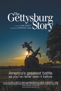 Noted filmmaker Jake Boritt is coming to Carlisle on Wednesday, May 7, 2014 for a special free public showing and discussion of his latest film, “The Gettysburg Story,” a state-of-the-art documentary about the pivotal Civil War battle narrated by actor Stephen Lang. What makes this film especially unique and cutting-edge is Boritt’s use of high-definition camera-enabled drone aircraft. His innovative project quite literally depicts the 1863 battlefield from a perspective that you have never seen before. You will be amazed at the visual spectacle and fascinated by Boritt’s discussion of how 21st-century technology helped bring to life this classic 19th-century American story.


 The reaction to President Obama’s