Student Projects

Category: Tutorials

Formatting Images in WordPress

This post offers tips on how to format images in WordPress. For writing essays, images are very important as they help bring your essay to life and enhance it. Here are steps on how to format images:

Alternative Text

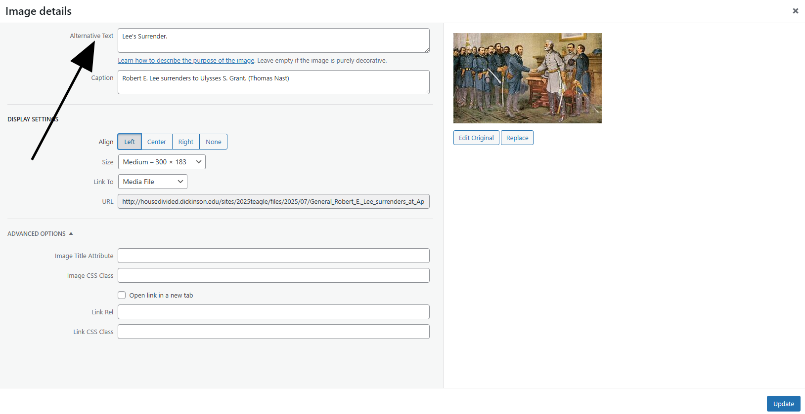
This arrow is pointing to Alternative Text. (Source)

Alternative Text Captions

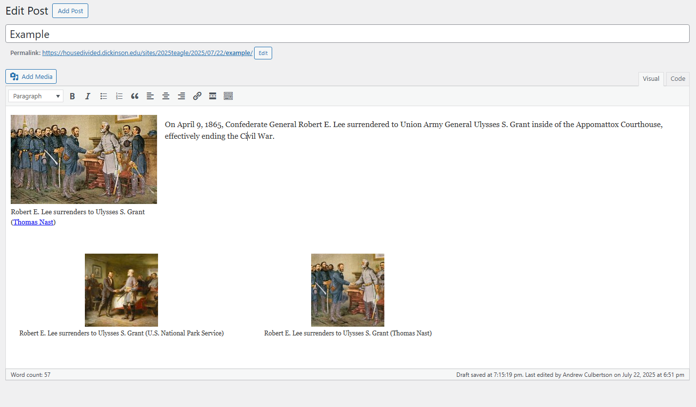
Alt Text Captions are short text descriptions for the visually impaired. To add these captions, insert an image, click on the image and click the pencil icon at the top. At the top, a box that says Alternative Text will be listed. In the Alternative Text box, add a short description of just a few words describing what is going on in the image. The image in my example is that of Robert E. Lee surrendering to Ulysses S. Grant, and under Alternative Text, I simply put “Lee’s Surrender.”


Media File

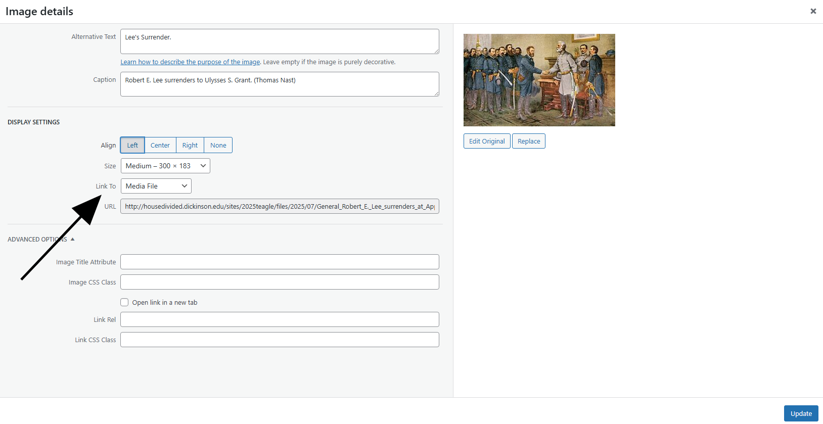
Arrow pointing where to link to media file. (Source)

Connecting to Media File

To connect an image to a media file, click on an image, click the pencil icon, and under Link To, click Media File. This is important because linking to media file allows you to see the image closer and clearer. When you upload your post, click on the image and it will take you to another page of just the image itself, allowing you to get a closer, higher quality view of it.


Caption

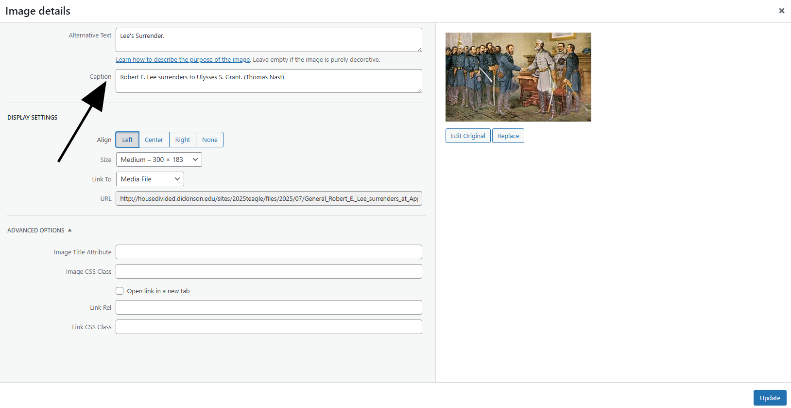
Arrow pointing to where you insert a caption. (Source)

Captions and Credits

Once again, click on an image and click the pencil icon, and under Caption, write a description of what the image is showing. Generally, these should be very slightly longer than what is written in the Alternative Text box, but not too long. For example, the photo I chose is an illustration of people in a courthouse, but I don’t just say, “People in a courthouse,” I say who the people are, Robert E. Lee and Ulysses S. Grant, and the details of what they are doing, which is that Lee is surrendering to Grant leading to the end of the Civil War. Make sure to include your source in parentheses at the end of your caption, and embed a link too.


Examples

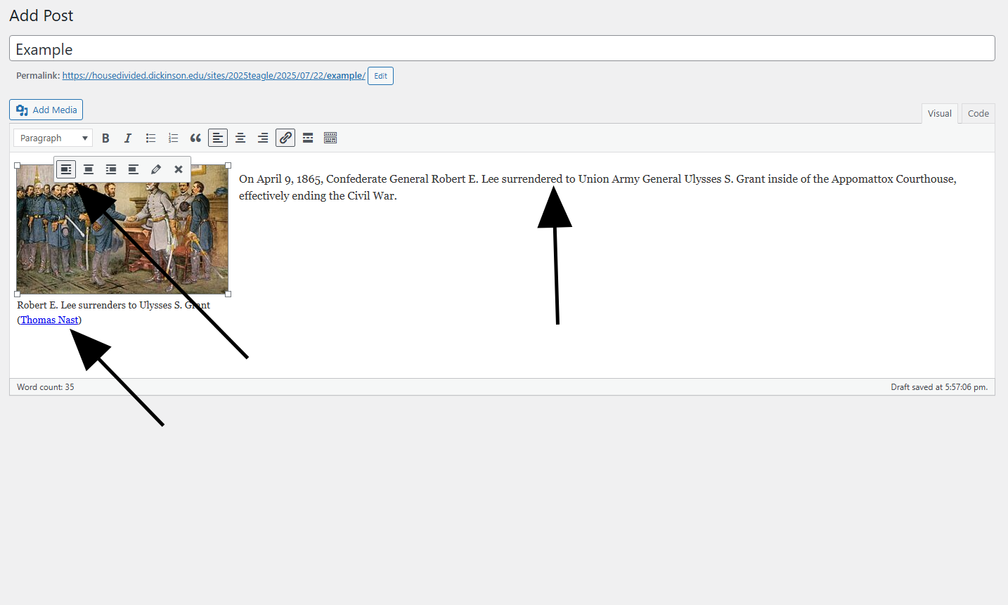
Arrows pointing to the image alignment, the wrapping text, and also the image source with a link embed. (Source)

Wrapping Text

Insert an image, click on it, and then click on either Align left, Align center, Align right or No alignment. This will align the image with your essay text. Generally, you should go through all of the options and choose what looks like the best fit. For example, this image next to this paragraph is aligned to the right, that’s why this paragraph has been moved to the left. Remember, the wrapping text that is next to the image should be related to the image.

Image Sizing

Image sizing is another important key. All of the images on this page are set to Medium, and because they are linked to a media file, you are able to click on them to expand them. There are options for Large and Extra Large, but they can take up a large space of the page, especially if one is Extra Large. In most cases, Medium will work just fine, as long as you have it linked to a media file. Custom sizing is also very important. Sometimes, none of the sizes provided will be adequate, so when you click on an image, click the pencil icon and go under size, you are given the option to choose a Custom Size. Cropping images is also important. Sometimes there are images you have to crop in order to focus on the most important aspect of the image, which might not be the entirety of the actual image.
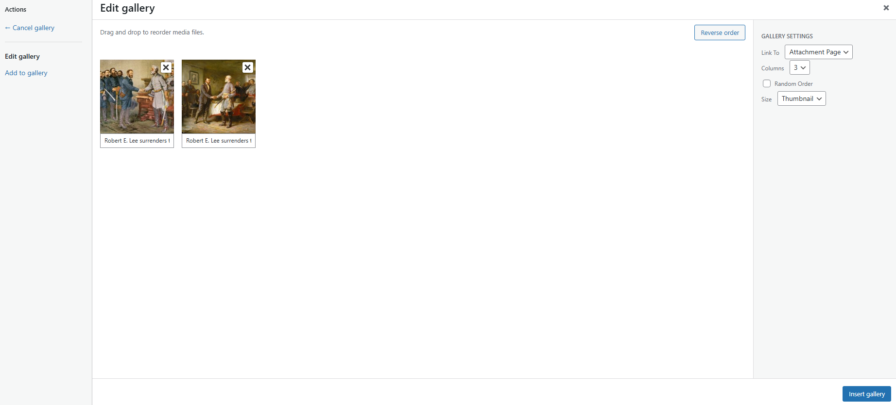
 

Image Galleries

To create an image gallery, click Add Media at the top of the screen, and go to Create gallery. Select the images you want to add to the gallery, and caption each of them. Once you’ve inserted a gallery into your post, it will look something like this:

Organizing and Editing your Close Reading Essays

text, context, subtext. 

That’s the formula for your Close Reading essays, but what exactly does it mean? When I wrote my sample essay, I initially struggled to nail the organization. So in this post, I’ll expand upon this “text, context, subtext” essay structure and provide advice on how to write and refine your papers.

A young woman speaks enthusiastically while gesturing with her index finger.

Olivia Whittaker

Introduction 

Begin with a short intro paragraph. Don’t dive too deep into background here, but briefly summarize the context of your literature. Include the author and setting in which it was written, and mention any major event or circumstance that would have been a primary influence on the text, but keep in mind that you will go into much more detail in your “context” section. Wrap up your intro paragraph with a clear analytical thesis statement that addresses the author’s intent and strategy.

Text

Don’t overthink this section. This is a literal overview of your text, so don’t bury it in analysis. Summarize the structure– this could mean the number of pages, stanzas, lines, etc. (the level of specificity can depend on the length of your text and the importance of structural details). And summarize how the work is organized: describe its major themes or topics and how it moves between them. You can include a couple brief insights on the author’s rhetorical technique, such as the use of major/recurring metaphors or themes, but don’t write an IB English paper.

Context 

Consider beginning your context section with a bit of background on your author. Where are they from? What circumstances did they grow up in? How did they get to this point? Also discuss the context of your specific text. What historical events or circumstances informed it? Why did the author write it? What was its relationship to the culture of the time?

Subtext

This is where most of your analysis will be. Discuss authorial intent and go deeper into how the author’s circumstances influenced their writing. Try to make connections (compare/contrast) to other readings you have done for the course– you could also start doing this in the context section and then expand on it here.

Conclusion

In addition to reinforcing your thesis, consider turning towards the future a bit with your conclusion. How did/might things change since the text was created? What insight might the text give us in that respect? Or what place might it have in the modern culture?

Editing Advice

  • Always try to avoid passive voice. Passive voice is when the subject of a sentence is acted on by a verb rather than performing an action itself (for example: “His request was dismissed.” vs. “His boss dismissed his request.”) There are several reasons for avoiding this, but the main one always given by Prof. Pinsker is that it obscures the actor in the sentence. If you say “His request was dismissed,” you’re omitting the important detail of who dismissed the request.
  • Look for phrases that could be streamlined. Many of us habitually fluff up our writing with extra words that don’t aid us in communicating our ideas. For example, take the sentence: “It was bright, warm, and sunny on the Fourth of July last summer, and there were many people who celebrated outside.” a more concise and equally communicative version of this sentence could look something like: “Many celebrated last Fourth of July outside in the summer sun.” Be cautious of those “it is”/”It was”/”there were” phrases making your writing extra wordy, and look out for details that are redundant (like “bright” and “warm” being used in addition to “sunny”).

Heed the assignment page and advice posts for your Close Reading assignments, but don’t completely abandon your own authorial voice or style. Write an essay that only you can write– arguably the most valuable part of your academic writing will be the perspective that you bring to it.

You’ve got this!

Boiling Line Sketch Tutorial

Boiled Line Sketch of Carrie PinkneyA “boiling line” effect is a drawn visual effect in which two or more similar versions of one drawing (or tracing) are edited together in a loop. The result is a line drawing that subtly shifts (or “boils”), appearing as a sort of living sketch. Here are some examples of when this technique might be a particularly good option:

  • You don’t have many images and are trying to make your content more visually engaging (especially if you prefer not to use generative AI to animate images)
  • The images you have are blurry/low quality, tracings could be clearer
  • You’re considering ways to get more creative or artistic with your content


This technique takes a bit of time, but you don’t need to be a skilled artist to do it. You do, however, need something to draw on. The least you’re going to need is a device with a screen such as a cellphone plus your finger to draw, but working on an iPad with a stylus/pen is ideal. You can use almost any drawing software, but this particular demonstration uses the free app Sketchbook.

  1. Once you open your drawing app, create a new canvas. The ratio of length to height should be about 16:9 if you want it to fit in a WeVideo project. I use a canvas size of 3840 x 2160 pixels for this.Creating "New Sketch" on Sketchbook app and setting the canvas size to 3840 x 2160
  2. Import the image you want to trace and size it to the canvas if needed.Pressing the "add image" icon on the Sketchbook app, showing imported image of Carrie Pinkney
  3. Locate your “layers.” Turn down the opacity of your image layer. You should still be able to see details but it should be light enough so that your black tracing lines will stand out.Showing "Layers" located on the right side of the screen, turning down opacity of image layer
  4. Create a new layer above the image layer.
  5. Select a brush to draw with (you may want to quickly test a few out before deciding), adjust the size and opacity to your liking by pressing on the brush again, and set your color to black.Creating a new layer with the "+" button, selecting a brush from the brush panel on the left of the screen, changing the color by tapping on the color circle
  6. On your new layer, trace the image. You don’t have to trace every tiny detail– just keep enough to effectively convey the subject, and don’t worry about making your lines perfectly smooth. You’ll have to simplify some things (and extrapolate a few details if your image is blurry or faded). You can reference how I simplified the facial features if you find it helpful.Tracing example with dark black lines overtop low-opacity reference image
  7. Hide your image layer and export this drawing.Pressing the menu button, "Share/Export," "Share," "PNG," then "Save Image"
  8. Lower the opacity of your first drawing layer and create a new layer.
  9. On the new layer, trace your first drawing. The lines don’t have to be perfect (in fact, they shouldn’t be), but keep in mind that the more they deviate from the first drawing, the more dramatic the effect will be.Turning down opacity of initial tracing by tapping on first tracing layer and adjusting the opacity slider, then tracing over it on a new layer
  10. Hide the first drawing layer and export the second drawing.

You now have two similar drawings. If you want, you can create more, but otherwise just edit the two images switching between each other a few times on your editing software (I advise that you have each clip no more than one second). Make sure the last image is different from the first image so that the clip can loop seamlessly. On some drawing programs like Procreate, you can create this video with an animation tool. Otherwise, just use your regular video editing software.

Tip: If you are comfortable with your drawing software and up for it, you can try adding background and color layers to your project.

Colored boiling line sketch of Carrie Pinkney with photo background of Dickinson College

Sound Effects Tutorial

When you’re using WeVideo, make sure you balance the music and the audio. WeVideo gives you the option to adjust the sound levels of any audio that you insert. Ideally, your audio recording should be louder than your music track.


First of all, to insert an audio recording, click on Project bin in the top left corner. From there, click on Add media, and you will find a drop down menu where it says Upload. Click on that, find the recording, drag it to the uploads and it will appear in your Project bin. Drag the audio recording down to the bottom of the page, where you will be able to insert it in the audio section.

Once you’ve inserted an audio recording or a music track, click on Audio and Opacity. From there, a drop down menu will appear with the options “Show audio level” and “Show opacity level”.

After clicking on “Show audio level” you will see a straight blue line across your audio recording and music track.


You can click anywhere on this blue line to establish a point. By moving the point upwards, you are increasing the sound of the audio, and vice-versa.

I keep my audio recordings at max volume, and I keep the music track around halfway, and toward the end of the video, I fade out the music with the credits for extra effect.

If you find that there is not much of a difference between the audios, double click on either bar and it will take you to a screen where you can further adjust the volume. For one of my videos, I had my music track at 70, while my audio recording was at 300. Make sure the volume of your audio recording is to the right of the white line, and make sure the volume of your music track is to the left.


In addition to your audio recording and music track, you also have access to special sound effects. These can be found by clicking on “Audio” in the top left corner of the screen. From there, next to the “Search audio” search bar at the top of the screen, there is a drop down menu on the left. Click on this menu and you have the options to search for either Music or Sound Effects. As stated above, to adjust the sound of the sound effects you do the same that you did to adjust the sound of the music track or audio recording.

If you still have trouble with the music being too loud and your voice being too soft, just keep playing with it until it sounds good to you.


Tips on Close Reading Essays

While I was writing my close reading essay on Lincoln’s letter to George Robertson, I went through several drafts with Professor Pinsker to improve it. Here are a few small tips that I learned along the way, from getting started with ideas to working with citations. 

Girl writing at a computer

Hard at work!

  1. One way to close read is to briefly draw in another document to compare the ideas and gain context. For me, this was somewhat easier; the Robertson letter was presented with two other letters that contained Lincoln’s thoughts on the sectional crisis, so it was easy to track how his ideas evolved and changed based on who he was talking to. Think about all the documents that are a part of the curriculum and try to see where one might reflect or differ from another.  
  2. For most history classes you will take in college, your professor will want you to use Chicago footnotes. Although it is not required that you use them here, it could be useful to try them out now. Remember not to put a footnote in the middle of a sentence, and instead place it after the punctuation. Normally, you would use an actual footnote, but because WordPress doesn’t have this option, place the number in brackets. Often, you will include an entire hyperlink in the citation. However, to make it appear less messy, try to just type out [WEB] and attach the link to this word. 

Sample Chicago citation

  1. For these essays, it isn’t necessary to use ellipses for quotes unless you are omitting something from the middle. Make sure, however, that you don’t change the meaning of the quote for your argument by cutting key information. 
  2. One of my main takeaways from writing this essay is to try to explain things succinctly. I often fall into the trap of thinking that for a college-level essay to be “smart,” it must use big words and long sentences. However, this sometimes ends up hiding your meaning. 

Good luck writing! 

Image and Text Effects Tutorial

Image and text effects are a great way to make your video more engaging and to add life to your images. These are just a few examples to get you started, and I am sure that when you begin playing around in WeVideo you will be able to discover a lot more depending on what image you are looking at. Think about what parts of your image and text would be the easiest and most useful to enhance and how it would help your viewers to understand the topic better. 

  • I use an app called Vimage to easily add overlays to images. For images that illustrate an outdoor scene, I have added overlays like falling rain, snow, or tree branches/grass swaying in the wind. There are a ton of different options, so take some time to explore.  
  • You can also use Vimage to add simple animation to images. Effects “Zoom” or “Layered Foreground” (located in the 3D Parallax section) will scan the image, locate the key figures, isolate them from the background, and have the two layers move separately from each other. I normally have used this with images that already depict “action,” like the illustrations found on the Slave Stampede website. 
  • With both of these above options, make sure to crop out the watermark at the bottom of the finished product! 
  • If there is a keyword or phrase in a letter, poster, or newspaper (for example, the headline of a newspaper), you can gradually enlarge it. Add the image like normal to the video, but add an additional video/text track above. To this track, add a version of the document cropped to just the words you want to highlight and position it over where the words were in the original document. Go to the animation settings and make the words grow gradually in size. Make sure they don’t end up overlapping with another word. 

WeVideo screenshot with growing text

  • You can also modify the above directions to layer different images. Play around with adding transitions and animation to the image added above to add additional movement.  

WeVideo screenshot with layered images

  • It is also fun to add a “Page Turn” transition between pages of letters, newspapers, or other documents. 
  • Sometimes it can enhance your video to add extra information/a caption. I did this for my Frances Harper video; although I wanted to include context on her grave, I couldn’t start talking about something completely new after finishing the poem. If you feel like there is a certain part of your narration that you want to highlight, you could also add that to a text box. Try to keep the font/color somewhat simple, and feel free to add a transition to the text.

WeVideo screenshot with a captioned image

  • Don’t be afraid to have a few extra images or videos after your spoken audio is finished. Think carefully about what the lingering effect should be. For example, for the video I did that narrated Frances Harper’s poem, I added a few images of her published works, her at different points as she aged, and her grave. This helps to draw out the fact that even though Harper didn’t know at the time of writing the poem if slavery would ever end, she was eventually able to live in a free land. This also gives you an opportunity to add some more information with a caption.

Transition Tutorial


When I first started making videos on WeVideo, my instinct was to only use a few transitions for the entire video so I wouldn’t distract from my content. However, this just made my video feel unfinished. Transitions can be a fun way to add variety to your videos, making them more engaging and highlighting the specific meaning of your photo/video. Below are a few tips that I have learned while working to hopefully help you create a better video. Happy video making! 

  • Try to think about what type of transition fits the image/clip. For example, “Filmstrip” wouldn’t make sense with an 18th-century illustration, but I like to use it with a photograph or a black and white video. 
  • If you are trying to show the contrast between two images, maybe play around with a transition that would momentarily hold both images on screen at once, like one of the “Wipe” varieties or “Slide.”Transition that splits two images
  • Try the “Page curl” when transitioning between pages of letters or books. 
  • However, just because a transition makes sense with the first photo doesn’t mean that it makes sense with the second. For example, for one of the videos that I made I used a “Page curl” transition after an image of a letter, but it led to a painting of King George, which I eventually had to change. 
  • I sometimes use the “Burn” transition when I have a more violent or painful image because of the association with fire.  
  • “Fade to white” is sometimes useful when I have a more positive/hopeful image related to emancipation or freedom. 
  • Sometimes when I am using two similar images back to back (like two of the illustrations colorized by the House Divided Project), I use “Cross fade” to make the transition more seamless.
  • When in doubt, use a simple transition like “Dip to Black.” Having a different transition in between every image, especially if the images are short and in rapid succession, could be distracting.
  • Stay away from colorful/complicated transitions like “Rainbow” or “Paper Plane.” They could detract from the seriousness of the message you are conveying in your video. 
  • If you are creating different layers of images/clips in WeVideo, you can still apply transitions to multiple images to add some additional movement. A layered image with two different transitions added
  • I like to place a simple transition after the last image/clip so that the video does not end abruptly. 
  • Another thing to keep in mind is the minimum amount of time that a transition can last is 1 second. Make sure to rewatch your video to make sure that the transitions didn’t cause the images and audio to fall out of line.  Transition setting tab with duration settings


Powered by WordPress & Theme by Anders Norén